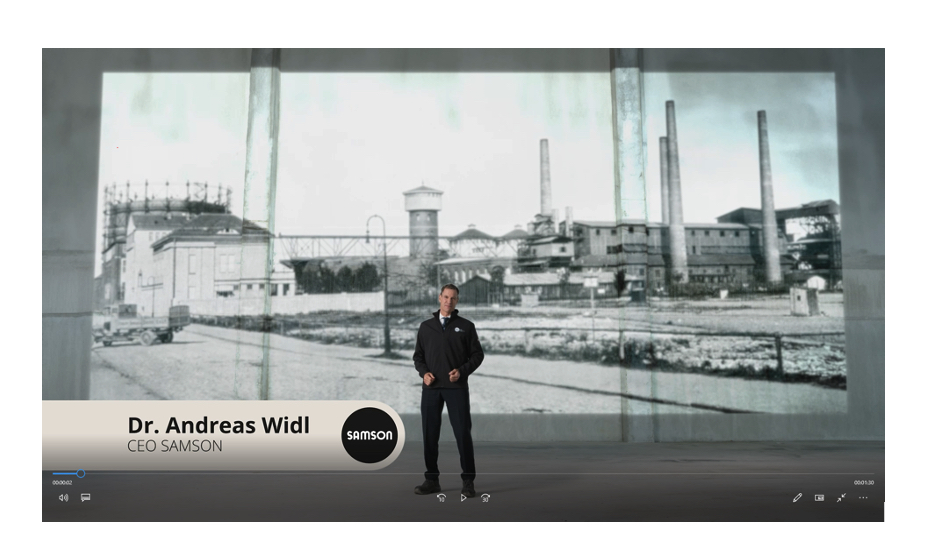
TEXT OVERLAYS (such as names and titles)
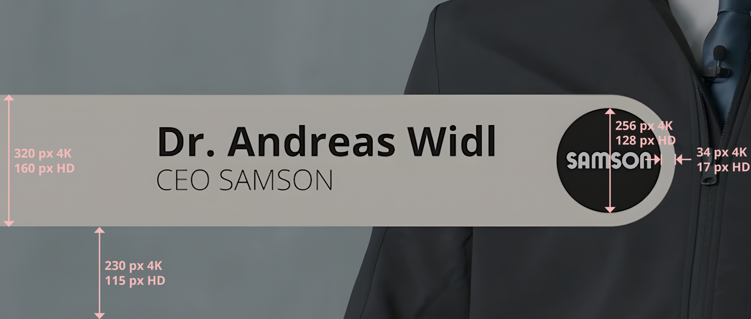
The characteristic beige strip with the black SAMSON logo at the end is a central design element. It includes the shape of the logo and ends with it. The strip is animated and superimposed from left to right.
Typographic guidelines
1st line: Name in Open Sans BOLD, font size 100
2nd line: Job title in Open Sans LIGHT, font size 70
Spacing and sizes
- Strip height: 320px in 4K/160px in HD
- Distance from the lower edge of the screen to the strip: 230px in 4K/115px in HD
- Diameter of SAMSON logo: 256px in 4K/128px in HD
- Distance of SAMSON logo from the right screen edge: 34px in 4K/17px in HD
CLOSING CREDITS
The closing credits follows a specified order to ensure a unified brand identity:
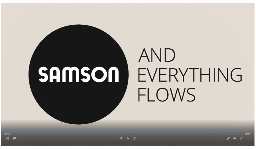
- The SAMSON logo is first displayed without sound and remains visible for 5 frames.
- Then the slogan animation starts.
- The slogan remains on the screen for 4 to 5 seconds, depending on the musical accompaniment.
- This sequence creates the visual wrap-up and provides a recognizable brand moment.
1. Form
The following format specifications apply to all SAMSON films:
- For optimal legibility, no more than two lines should display.
- Central placement at the lower edge of the screen — the exact position can be adapted to the media output.
- Always positioned within the text area of the respective output format.
- Display in white font on a semi-transparent black strip for optimal legibility.
- No scrolling effects — each subtitle is synchronized to the spoken text in the natural flow of speech.
- Automatic integration into the specific media output.
- Users must always have the option to turn the subtitles on or off.
3. Letterbox
When using a letterbox, the following guidelines apply:
- The text is centered at both the top and bottom.
- The letterbox is shown in black with 50% opacity to increase legibility without heavily concealing the film.
- Leader dots (“...”) at the end of text are taken into account when calculating the maximum strip width.
SYNCHRONIZATION
Precise synchronization between subtitles, image and sound is essential:
- Subtitles are always synchronized with the spoken text and remain visible for at least 1.5 seconds to allow a comfortable reading speed.
- During video editing, special attention should be paid to making the subtitles in every media output easily legible and keeping them completely within the safe text zone.
- At final rendering, synchronization must be inspected again to ensure an optimal user experience.


