LOGO

CORPORATE DESIGN MANUAL

THE LOGO

The logo is the central element of the visual identity and clearly and memorably represents the brand. It promotes strong brand recognition and is essential for differentiation in the market.

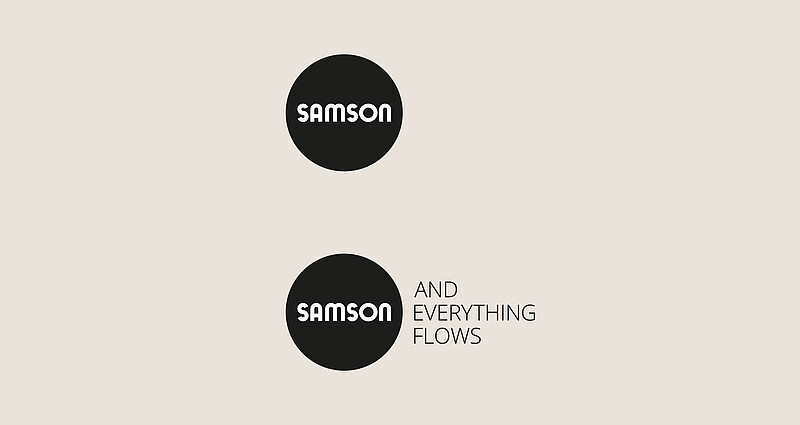
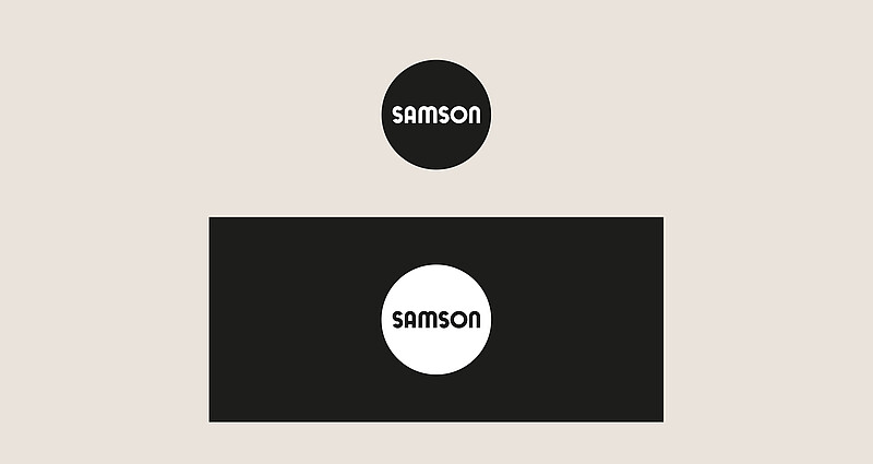
Two versions of the SAMSON logo are used: Black with white font for light backgrounds and white with black font for dark backgrounds.

LOGO AND SLOGAN

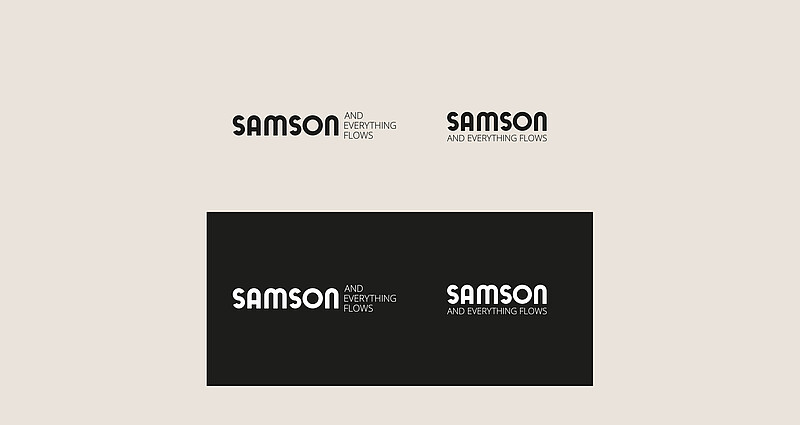
The slogan appears in black on light backgrounds and in white on dark backgrounds.

Versions

Surrounding space

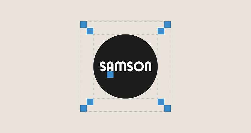
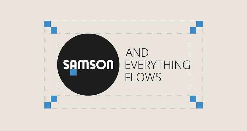
The surrounding space determines the minimum space around the logo where no graphic element is to be positioned. The size of the surrounding space is based on the width of the letter “A” in the logo. This space is at least twice the width of the letter “A” in all directions.

THE WORDMARK

THE WORDMARK WITH SLOGAN

When the wordmark is used together with the slogan, there are two options for placing the slogan: It can appear to the right next to the wordmark, in which case each word of the slogan is on a separate line. Alternatively, the slogan can be placed directly below the wordmark.
BRAND HIERARCHY

BASIC SAMSON LOGO WITH AND WITHOUT SLOGAN

The SAMSON logo can be used standalone or in combination with the slogan.

DEPARTMENTS AND PRODUCTS

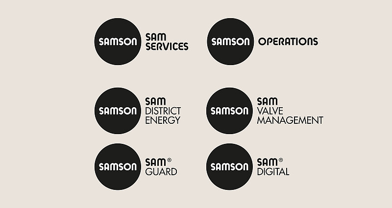
The logos of the SAMSON AKTIENGESELLSCHAFT departments always use the SAMSON Funky Regular typeface for the department names. In addition, the product name is set in the Futura Medium typeface. Department and product names are always to the right of the SAMSON logo.

SUBSIDIARIES

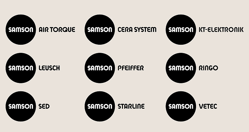
The logos of SAMSON AKTIENGESELLSCHAFT subsidiaries always use the SAMSON Funky Regular typeface.

Downloads

More downloads

Contact

Do you have any questions or feedback?

Please write to us: Contact form »